Big Sur System Update — Cargo Cult in Progress
A few notes on the system update process in Apple’s Big Sur (macOS 11).

Over several years — that is, the last decade — we have seen the principal mindset directing the user facing aspects of application and system design shifting from the concept of usability towards UX (user experience). As we’re almost there, it may be worth confronting these two apparently synonymous concepts of design guidelines and directions, here on the example of Apple’s Big Sur system update process.
First, we may recap some of the goals of usability, as this is now pretty much a concept of the past:
- An application should reflect its state to the user.
- This is done so that the user may form a working model of the system.
- This working model allows a user to form expactions regarding the state of the system and how she may interact with it, what she can do or not do.
Mind that this established working model hasn’t to be necessarily an accurate representation of the system in the technical sense. As long as this allows the user to form appropriate expectations, any kind of metaphor still suits the purpose.
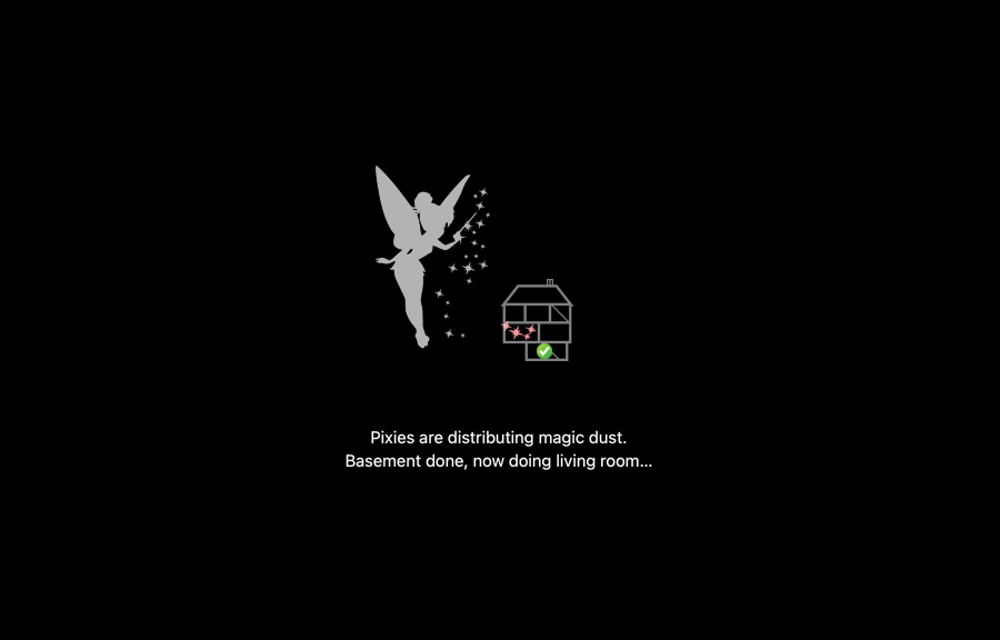
“Pixies are distributing magic dust.
Basement done, now doing living room…”
As long as the UI conveys an appropriate working model, technicalities do not matter.
In this hypothetical example, the several rooms visited by the magic pixies may correspond to the actual architecture of the system as visited by the update process. Thus, the progress of the pixies through the house representing the system still matches the technical process and allows the user to form expections regarding the process.
Admittedly, there isn’t much that a user may do about an update process, or how she may interact with an updating system as this isn’t in an interactive state. Still, there are some crucial aspects to the feedback as conveyed by the system, empowering users to form expectations:
- Is the system still alive? (As it is certainly not responding in this state)
- How long will this take? (Until the system becomes interactive again.)
- In case something went wrong: Where did it became stuck? (Useful for customer support.)
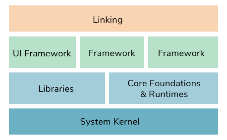
In terms of classic UI-elements a progress bar is the abstract answer to most of these questions. However, there is more to this, especially, as a system has to re-enter the process at several stages (e.g., for remounting a file system or for relinking the system after basic updates have been applied, updating preferences, and so on.) It’s a discontinuous process, and, in case the system becomes stuck and aborts the process, any information on the particular stage this happened may be helpful, as well. (“So the pixies did finish the master bed room?”)
In the days of old, when usability was still the core paradigm, Apple’s systems dutifully reported each of these stages of the process in appropriate technical terms. However, this may have been a bit too technical for the hoi polloi of non-technical users, it may have been even a bit scary. — Certainly, a scary technical experience is not the best product experience. So how does Apple handle this in the days of UX and its desktop system inching towards the iOS experience?
The Big Sur System Update Experience
This article is very much inspired by my recent update experience to Big Sur, macOS version 11.2.1. After a period of unusal, deteriorating network performance, I was informed by a popup banner that a system update was ready, asking to restart the system. Since I’ve automatic updates disabled, I visited the Software Update section of the System Preferences, where I found that the update had been downloaded already (thus explaining and resolving the recent network issues at once) and was prompted with the option “Update Now” embodied in a button.
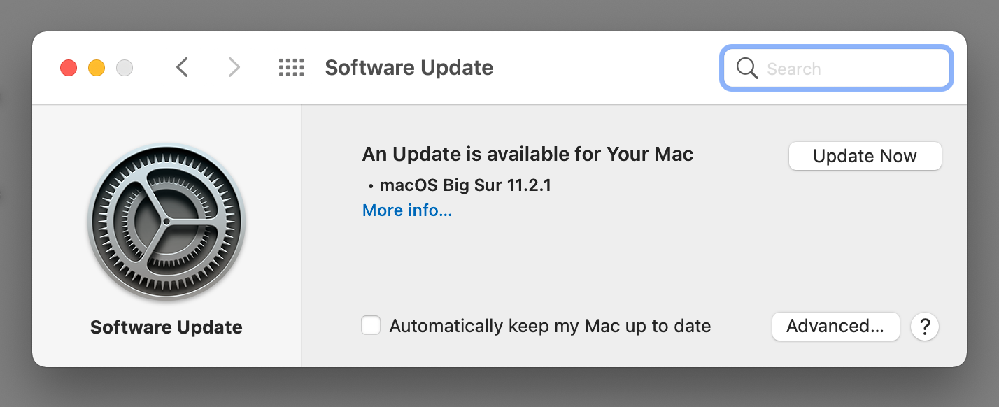
(You never take a screenshot in time, before learning you would have needed to do so…).
Clicking the button revealed an authentification prompt in order to collect the admin password required for the process. As I did so, the prompt went away, revealing the preferences window as it was before:
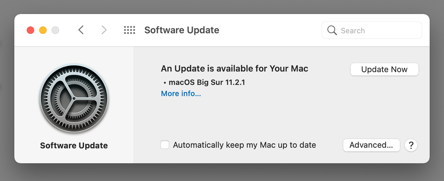
In the age of mobile first (which is apparently the appropriate metaphor for the desktop), button states are for Boomers. So the “Update Now” button of the preferences stays enabled and ready to click. To all our knowledge, the update process may have failed silently and a user may be tempted to click the button again and again, while that system is shutting down, which takes several seconds. (I didn’t try this, but it would have been interesting to see, whether the button was still clickable and was to trigger an interaction, or not.) Just in case you asked, the appropriate behavior would have been a disabled button state, maybe accompanied by an activity indicator (like a spinner).
By this, we enter the update process proper. This starts with an enlightening black screen (all update screens reconstructed, cropped aspect):

Eventually adorned by the Apple logo…

And finally complemented by a progress bar:

The progress bar advances slowly, until it eventually reaches about a third of the total extent:

At which point the system restarts the update process in order to advance to the next stage, and, after a black screen, and a black screen + Apple logo, we’re back to a progress bar starting at the very beginning, once again:
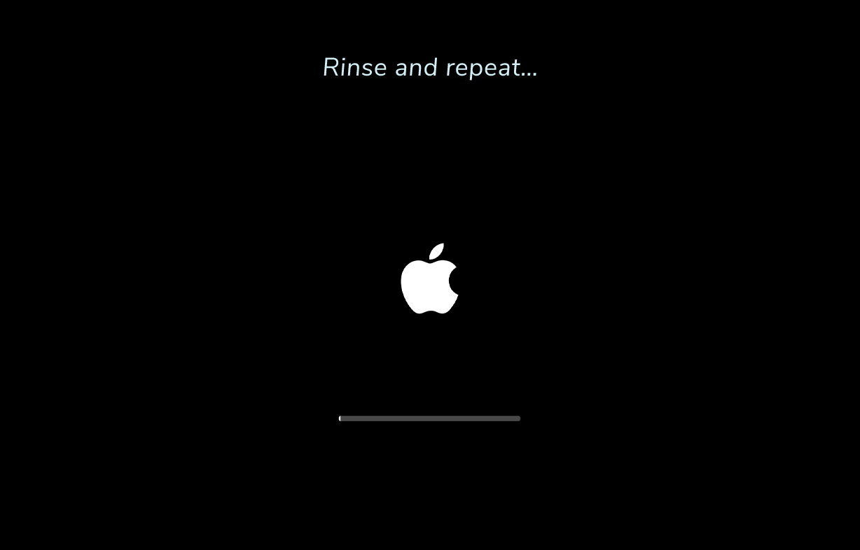
This is repeated several times. Sadly, I failed to keep track and didn’t count how often. Notably, the progress bar never reaches a significant portion of the total extent, before the system re-enters for the next stage of the update process, starting over at zero. The partial progresses do not appear to add up to 100% and, while the bar usually progresses rather quickly over the first few progressions, it doesn’t seem to catch up, where we left.
Eventually, we’re up for a change: as the progress indicator reaches about 50% of its total extent, we suddenly see a message “Update 100% complete”!
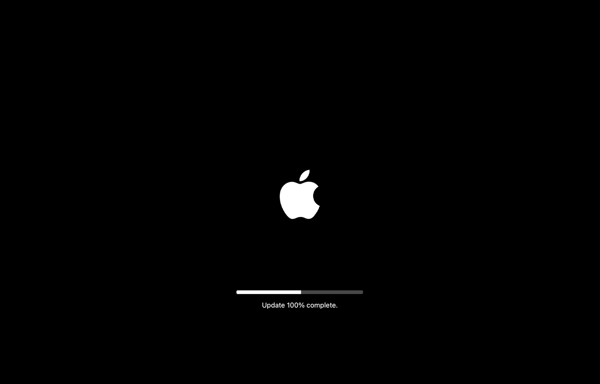
But this is a short-lived experience, as the progress indicator gives way to a somewhat narrower incarnation of itself:

Which it is then quickly complemented by a text label announcing the time remaining, here, “About 12 minutes remaining…”, counting down the minutes:

To make a difference, this view is now stable and the label is updated appropriately, until it changes to “Less than a minute remaining…”, which is eventually followed by the final restart into the updated system.
BTW, 12 minutes on an Apple Silicon M1 device? Are you serious? What the <beep/> is this doing?
Now, this is totally all over the place. With the exception of the last stage, the progress bar doesn’t serve any purpose, besides showing some, however jerky activity. As it just shows progress over what is apparently a random extent of the total, it doesn’t convey any information that a simple activity indicator, like a spinner, wouldn’t have provided, as well. Even worse, the surplus information apparently included in the progress indicator is highly irritating at best.
At this stage, the unlabeled progress indicator is just a leftover, a cargo cult, rebinding the UI to the days of usability, but it’s more a religious thing, connecting to a richer past, when things still had meaning, than something that is actually serving a purpose or providing an accessible meaning to the present. Just like the bamboo planes often associated with cargo cult won’t persuade any real planes to land aside, the meaningless progress indicators and unlabeled update stages will not bait any real information to descend from transcendal realms and to magically associate itself to the vain indicators.
Neither do the unlabeled stages provide any means to form an expectation regarding how long the update process might take or at what extent of the total progress we may have arrived, nor does it include any helpful information at what stage an update might have failed, since there isn’t any meaning associated to the division into individual stages.
“The computer is frozen with a progress bar at about a quarter into.” — “Please, can you repeat the process and count the number of black screens?”
At this point in UX history, a system update screen like the following would have done, as well:
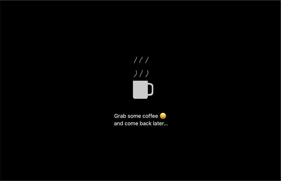
Notably, Big Sur is not the first Apple system to behave like this, it has been so for several years.
The Big Sur System Update Experience, Part II
But we’re not done, yet. As the system reboots, once the update process has finished, we are greeted with a dimmed log-in screen with the Big Sur default background image. Are our screen setting gone?
Moreover, the dimmed screen indicates a disabled state. Is the machine unresponsive and bricked by the update? As nothing else happens, an impatient user may be tempted to touch the mouse or trackpad, or even venture to press a key. And by this, the system, wonder of modern times, immediately springs to life. — Why was this screen dimmed in the first place?
(It seems, we were expected to grab a coffee and come back later, in deed. With the system rebooting unattended as usual, it would power down eventually, confronting the user with a nasty black screen and and a potential shock regarding the state and health of the machine. It seems, a series of meetings managed only to come up with the idea of an infinite power up state, beering the hazards of potential battery depletion, as an alternative. Which then gave birth to the idea that the best way out of this dilema was a low power consumption state that happened to be undiscernable from an unresponsive, disabled state. — A better idea may have been to boot into full interactivity and then power down from this to a still distinctive low energy state. Say, a dimmed gray screen with the Apple logo, similar to the install screens, thus feeding from this context, accompanied by a hello world message and/or call to log-in. Or just booting into said low energy screen, at once. But this may have been just a bit too Snow-Leopard-y to be considered.)
Still, we may be anxious regarding our system settings. Have these survived the update? If you haven’t signed in into the full Apple experience, your deepest fears are apparently confirmed, as the system confronts you with the very same screens regarding iCloud, Siri, etc, which you had seen in the initial install process already, before any individual choices and preferences had been applied. Is this the initial onboarding process all over again? As you navigate through various pop-ups by pressing the “Skip” button, anxiety rises: you configured everything of this already, are the settings really gone?
However, having viciously denied Apple’s generous offerings for the umpteenth time, we’re back to our well known and beloved desktop, just as it was before the update. So we are ready to go.
Actually, no. Before anything else may be done, the system procedes to check for further updates:
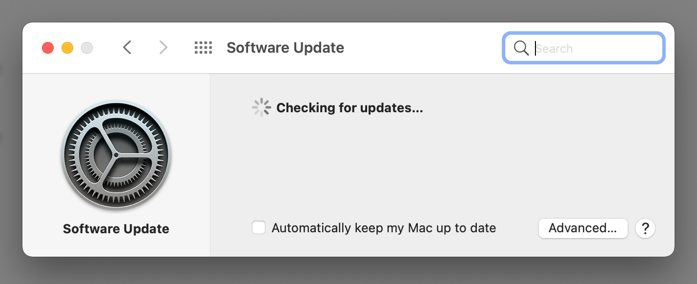
And eventually fails for unknown reasons:
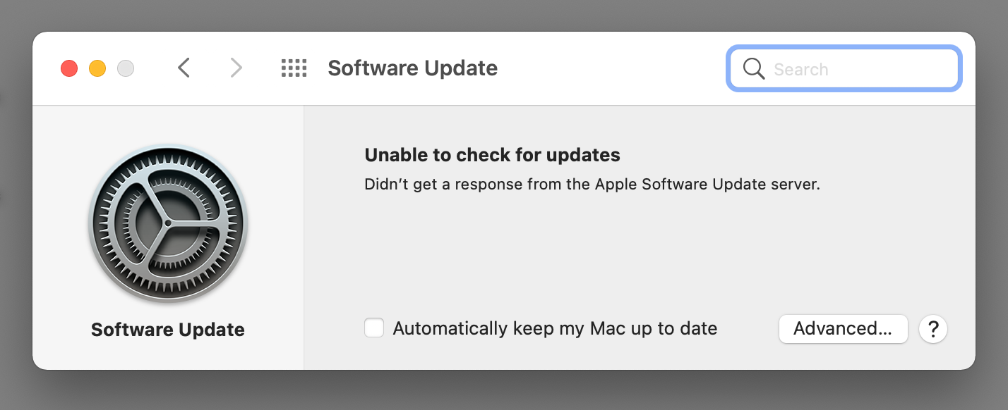
By this, we’re actually done and ready to go. That is, in my case, while network indicators imparted perfect connectivity, the network stack took a while to come up and to successfully establish any conncetions.
But, as they say, all well that ends well. I guess.
— Phew! —
Norbert Landsteiner,
Vienna, 2021-02-12