Minard / Morse / Tufte and Authenticity on the Web
Observations on information spread and authenticity of well-known objects on the Internet.
(Also, a visual whodunit. And a new reference image.)
Disclaimer: This article is by no means meant as a critique on Edward R. Tufte or his work, nor on Elaine Morse. On the contrary, I’m expressly grateful for the efforts made in bringing Minard’s work to our attention and for refreshing our memory of 19th information graphics in general.
When I was recently reviewing various versions of image files representing Charles Joseph Minard’s famous chart of Napoleon’s Russian Campaign of 1812-1813 (“Carte Figurative des pertes succesives en hommes de l’Armée Française dans la campagne de Russie 1812-1813”) from 1869 for my discussion of the subject (“Observing Minard Observing Napoléon”), I noticed something peculiar: While there are various scans of the graphic available on the Web, in varying resolution and compression quality, almost all of them seem to depict a single, uniform object. However, there are just a few exceptions. Notably, these exception differ in the weight of the black print, especially the stroke widths of any black lines and by this the overall balance, and color. Most notably, these few exceptions can be traced back to just two authentic sources, both official images from French libraries. Something peculiar seems to be going here.
Time to investigate…
I. Comparing Image Sources
Let’s have a look at the primary image sources available.
There are actually just few of them:
1) Official Images Available at French Libraries
There are two authentic sources depicting two separate copies of Minard’s “Camapgne de Russie 1812-1813”. Both of them show the entire sheet with Hannibal's crossing of the Alps on top. Here, we rather have a look at the chart of the Russian Campaign in isolation:
1.A) École nationale des ponts et chaussées
This image is found in Folio 10975 of the École nationale des ponts et chaussées, Paris, France, “Tableaux graphiques et cartes figuratives de Mr. Minard”, tabl. 28, available at the Bibliothèque numérique patrimoniale des ponts et chaussées in a series of files titled “Minard, Charles-Joseph (1781-1870), Tableaux graphiques et cartes figuratives”:

1.B) Bibliothèque nationale de France
Another authentic image of a copy printed from the same plate is to be found at the Bibliothèque nationale de France, département Cartes et plans, GE DON-4182, identifier ark:/12148/btv1b52504201x, catalog Nº FRBNF40650878, https://catalogue.bnf.fr/ark:/12148/cb40650878p:

Beyond doubt, the two images are representing the same entity and differ only in accidental imperfections and variations in print, like tiny splatters of ink, state of preservation, and exposure/contrast of the photo-reproduction. For the remainder of this article I will refer to the copy of the École nationale des ponts et chaussées, for several reasons, one of them being the higher resolution of the image available online. Also, in any following examples the white balance is adjusted slightly for clarity.
2) Elaine Morse / Edward R. Tufte
The authoritative source on Minard is, of course, Edward Tufte. He has popularized the chart of the Russian Campaign and even distributes reproductions as a poster, the closest you may get to owning the original as an average person. However, as noted in the image caption in a side-note of Edward R. Tufte, “Beautiful Evidence”, Graphics Press 2006, p.126, it’s a redrawing by Elaine Morse, and as mentioned in “The Visual Display of Quantitative Information”, Graphics Press 2001, 22nd ed. 2007, p.40, this redrawing was completed in 2002.
I’m here using an image of a PDF-scan found in teaching resources of a university (and it is presented here under the terms of fair-use as for scientific and educational purpose, as well):

The side-note found on the page immediately preceding this image reads:
At right, English translation of item in Charles Joseph Minard, Tableaux Graphiques at Cartes Figuratives de M. Minard, 1845-1869, a portfolio of Minard’s statistical map at the Bibliothèque de l’Ecole Nationale des ponts et Chaussées, Paris, 62 × cm, 25 × 12 in. This 1869 map is the last sheet in Minard’s lifetime portfolio. English translation by Dawn Fineley, redrawing by Elaine Morse.
(Edward R. Tufte, “Beautiful Evidence”, Graphics Press 2006, p.125)
However, the particular image, while attributed as, “Above, the original French version.”, shares all the significant traits, which we will explore below, with the translated version. We may conclude that the French version is a redrawing, as well, administered by the very same hand. Notably, the source referenced is the same sheet as the one here referred to as source 1.A.
3) Wikipedia
The most common source is Wikipedia. The file https://en.wikipedia.org/wiki/File:Minard.png is distributed as a free image from the Wikimedia Commons. It was selected as the picture of the day on the English version of Wikipedia for June 24, 2008 and a candidate in Wikimedia Commons Picture of the Year 2008.
According to the upload history, the image has been first uploaded on 28 December 2007 and then been updated on 17 January 2008 by a version including a restored right frame border, missing in the original upload.

As we may observe, the image shares some striking similarities with Tufte’s representation, both in weights of print and in color.
Let’s observe this in closer detail. (For the purpose of the comparison, all images have been adjusted to an equal, matching size of approx. 2.000 × 950 px.)
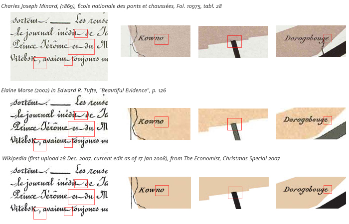
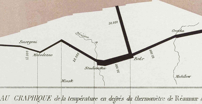
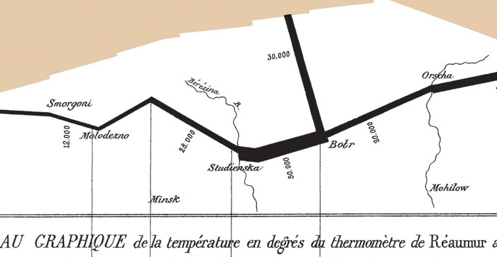
At first glance, we may observe that the two lower images (while the middle one is of lower resolution) share a common weight of the black print, which is heavier than the one seen on the top (the original). But there are more similarities between the lower two images, which separate them from the original:
- At the left, we me note a pronounced downward emphasis in the end strokes, not found in the original, also the stroke of the comma is a bit shorter, more vertical, and heavier in weight.
(However, ist must be said that the writing is generally extraordinary true to the original.) - The letters “n” and “o” in “Kowno” are connected, a trait not found in the original.
- In the original, the black stroke, representing the returning detachment to Polotsk, intersects with the colored area representing the gros of the Army by an s-shaped cap, while it's a blunt end in the Morse/Tufte version and the Wikipedia version.
- The end stroke of the terminal “e” in “Dorobouge” is different in shape, the lower two images emphasising the upward-right motion of the stroke.
A few further examples:
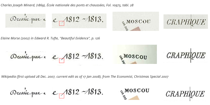
- At the left, we may observe the more rounded overall impression of the writing in general, also a lesser modulation of the stroke weight as compared to the original. Also, there’s a notable difference in the accent, common to the two lower details.
- Differences and similarities in the ascending stroke of the leading figure “1”.
- The location “MOSCOU”, not printed fully in the original, but appearing much heavier in the two other sources. Also, there's again a lack in modulation and, as may be observed in the slightly upwards pointing, V-shaped serifs at the top of the “M”, a generally more rounded impression.
- A difference in the modulations of the letter “G” in “GRAPHIQUE”, resulting in a more slanted impression of the letter as compared to the original.
While there is more evidence, it may be safely concluded, that the two lower versions, the one found in Edward Tufte’s publications and the one found on Wikipedia, are the same, but are not the same as the image provided by the Bibliothèque numérique patrimoniale des ponts et chaussées (École nationale des ponts et chaussées, Fol. 10975, tabl. 28). As the image found in Tufte’s publication shares all these significant traits with the translated English version, referred to as a redrawing by Elaine Morse, it may be fairly concluded that this a redrawing by Elaine Morse, as well.
Finally, on page 135 of Beautiful Evidence, near the end of “The Fundamental Principles of Analytical Design”, we find the attribute “redrawn” associated to a reproduction of the entire sheet (including Hannibal’s crossing of the Alps) in French language:
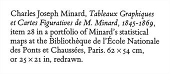
Alarmingly, most — if not almost all — discussions of Minard’s famous chart are not referring to the original, but rather to a redrawing!
II. Provenance
We may also trace the image’s way into the Wikimedia Commons: According to the Wikipedia file history, the image was first uploaded on 28 December 2007 replacing an older grey-scale scan. This new color image was missing the right frame border and a new version, complemented by a restored right border, was uploaded on 17 January 2008 and then reuploaded the same day in reduced file size.
(Wikipedia file history, “Minard.png”, thumbnail and user reference omitted, as of 19 Sep. 2018.)
Date/Time Dimensions Comment current 19:55, 17 January 2008 2,003 × 955 (671 KB) pngcrushed 06:28, 17 January 2008 2,003 × 955 (810 KB) restore right border 04:29, 28 December 2007 2,000 × 951 (861 KB) color quality version from The Economist, Christmas edition
Having a closer look at the file history, the initial upload (28 Dec. 2007) bears the comment, “color quality version from The Economist, Christmas edition”. It’s an illustration accompanying an article in the Christmas Special of The Economist, part of the 22 Dec. 2007 issue. The article, “Worth A Thousand Words”, can be found without a reference to the original date of publication on The Economist’s website as republished on 7 Oct. 2017. Indeed, there’s the same image, lacking the right frame border, as seen on the initial Wikipedia upload. It may be fair to assert that this is the source of that image. And, while the article doesn’t particularly cite an image source, it may be concluded from context, as the image is preceded by the sentence, “Edward Tufte, whose book, ‘The Visual Display of Quantitative Information’ is a bible to statisticians, calls it ‘the best statistical graphic ever drawn’.”
Based on contextual evidence, citations, and assessment of the images, we may conclude: The Wikipedia file is a copy of the version found in Tufte’s “The Visual Display of Quantitative Information” (probably the 2nd edition as of August 2007), scanned from The Economist’s Christmas Special of 22 December 2007. And, as it seems, the image found in Tufte’s book is a redrawing by Elaine Morse after the authentic print copy in Folio 10975 of the École nationale des ponts et chaussées, Paris.
(We may assume that the redrawing had been used instead of the original to facilitate the extraordinary continuity of the French version and the English translation (which may be observed in the above image), and, maybe, for reasons specific to the production and printing of the books, as well, but this is pure speculation.)
III. Color
As we're facing the rather astounding situation that one source is copying the image from the other and that next to none of the discussions of this outstanding cultural artifact is referring, unbeknownst, to the original, we have to asses further properties of the image, which have been taken for granted, namely color. Especially, since there’s a strange contradiction between the color seen in what I‘d like to refer to as “the common version” of the redrawing by Elaine Morse and the text provided in the description of the chart, which refers to the color as “rouge” or red. “Le rouge désigne les hommes qui entrent en Russie, le noir ceux qui en sortent.” (Red designates men moving into Russia, black those on retreat.)
Edward Tufte is referring to the color as transparent tan (Tufte 2006, p.130) and asserts the authenticity of the rendition found in his books in a side-note on page 131 of “Beautiful Evidence”:
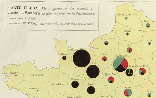
6 The text accompanying the map describes the invasion line as rouge or red. It appears the line never was red, even when freshly printed in 1869. Although red pigments are degraded by light, Minard’s maps are in fact bound in non-circulating portfolio with no light exposure at the Bibliothéque de l’École National des Ponts et Chaussées. Today the invasion-line color is exactly as shown in this chapter (confirmed by color control bars in our direct photograph of Minard’s original map), with no signs of color fading. In another map by Minard (below), bright red ink has now survived 184 years, again suggesting that today's tan invasion line was not yesterday’s rouge
Tufte further asserts this notion by a reproduction of Minard’s “Carte figurative et approximative des quantités de viandes de boucherie envoyées sur pied par les départements et consommées à Paris” (1858), which is also found in Folio 10975 and provided by the Bibliothèque numérique patrimoniale des ponts et chaussées:
While Tufte is certainly right regarding his notion of the semantics of color changing over time, we may still maintain a sceptic reserve regarding this choice of color, especially, if we compare them with the two authentic samples. While neither of the two images (1.A and 1.B) bear a color chart for reference, it is not to be expected that they are way off. Also, while the pigment may have not deteriorated, the paper has visibly suffered some yellowing, which, when reversed, should rather shift any semi-transparent tint towards magenta, thus separating it even more from Tufte’s rendition. (I don’t know anything about the specific workflow and this is not meant to suggest or allege any faults, but there are actually numerous ways something may go wrong when adjusting an image to a color reference, one of them converting an image prematurely to CMYK color space.)
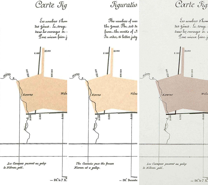
Here’s a comparison of the color as represented in the Wikipedia version (source 3, here used for the partial chroma overload in the scans of source 2 and also fairly in the middle of the two language versions as represented there) and in 1.A and 1.B as-is (no correction applied):

As noted above, the semantic contents of a color varies with time, and it happenes that the notion of “red” used to include paler tones (until approx. the early 1930s), which we wouldn’t necessarily recognize as red today. Having a look at other charts by Minard for similar tints, we may discover, besides some more pinkish tones, some similar samples which may be actually called red, some of them also featuring black overprint:

Notably, individual JPEG-images and the images as represented in the PDF version, available at the Bibliothèque numérique patrimoniale des ponts et chaussées, do vary. It may be fair to assume that the color in question might be actually somewhere in the middle of these samples.
IV. A New Reference Image
Arguably, there's a need for a clear and cleaned version of Minard’s “Campagne de Russie”. I even do have such myself, for my interactive version of the chart. Given the convoluted provenance of the existing images, it may be best to prepare a new one from the best available authentic source, in best resolution. This is, of course, the image available at the Bibliothèque numérique patrimoniale des ponts et chaussées (source 1.A). So I decided to prepare such an image.
Procedures:
- Clockwise rotation and crop to lower image part (6.238 × 2.966 px).
- While this resulted in a fairly straight orientation of the vertical lines, horizontal lines (at the bottom temperature chart) were still at a slight angle. This was corrected by a vertical skew by 0.2°, thus arriving at an orthogonal grid for the major parts of the image. While there may be still some perspective and/or lens distortion involved, no further transformation of geometry was applied in order to maintain a reproducible reference.
- The white point was adjusted as far as possible without affecting weights of black print.
- Remaining impurities where cleaned manually, thus resulting in black print on white background.
- Accidental imperfections, like stains and tiny splatters of ink, or broken lines (notably a broken letter “e” in “thermomètre”) were cautiously corrected or completed respectively.
- Color was obtained as a weighted average from various reference points, applied as various semi-transparent, grainy layers, overlaying the original color.
(By this still maintaining some of the original color information and aiming at a more paper-like appearance than may have been provided by a solid ink.) - The resulting image was resized to a size similar to the Wikipedia-file, 2.000 × 950 px, and a minor sharpening (unsharp mask filter) has been applied.
- Finally, a PNG-24 image file in sRGB color space was exported as the final product.
And this is the resulting image:
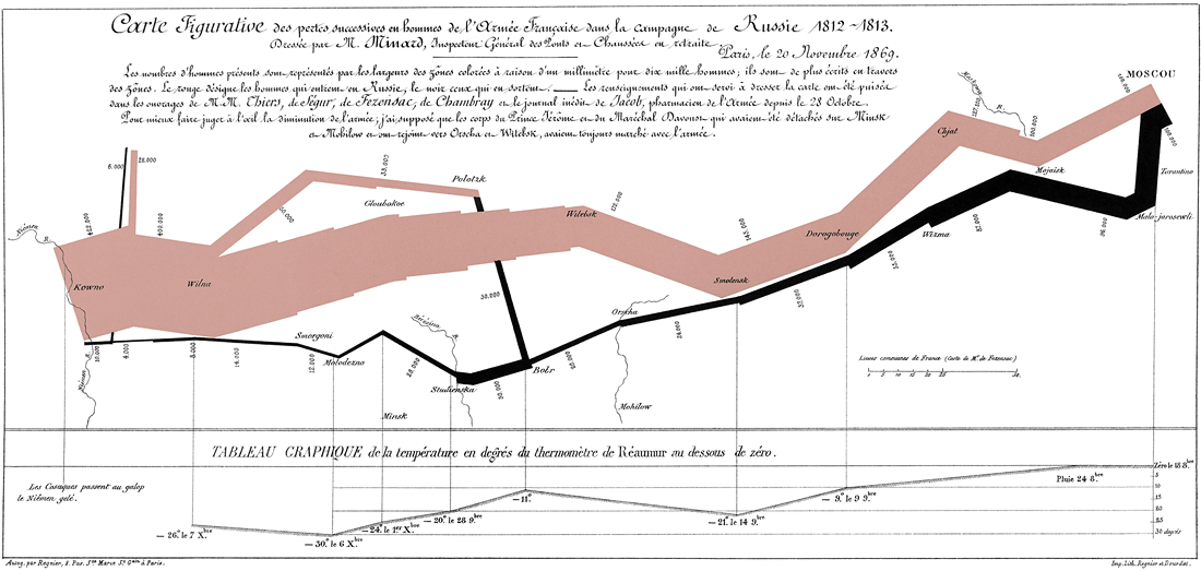
Charles Joseph Minard, “Carte Figurative des pertes succesives en hommes de l’Armée Française dans la campagne de Russie 1812-1813”, Paris, 1869. (Cleaned and reconstructed, Norbert Landsteiner 2018.)
derived from:
École nationale des ponts et chaussées, Paris, Fol. 10975, “Tableaux graphiques et cartes figuratives de Mr. Minard”, tabl. 28. Digitized image: Bibliothèque numérique patrimoniale des ponts et chaussées. (“Minard, Charles-Joseph (1781-1870), Tableaux graphiques et cartes figuratives”, accessed 2018-08-31).
Click for a larger image (2,000 × 950 px).
See also, https://www.masswerk.at/minard/.
The image, as far as I am concerned, is free to use, but a reference to the Bibliothèque numérique patrimoniale des ponts et chaussées and this page should accompany this image or any image derived from it. (Providing image references is always a good practice and positively encouraged.)
Postscriptum: Another, similar phenomenon is to be observed on the text level, where any citations of the obituary, I've seen, are referencing the author, Minard’s son-in-law, as “V. Chevallier”. Again, this seems to be implicitely citing Tufte, who just provides the initial, but not the first name in its entirety. However, it’s Victorin and the full citation is
Victorin Chevallier, “Notice nécrologique sur M. Minard, inspecteur général des ponts et chaussées, en retraite” in: Annales des ponts et chaussées, Series 5, Vol. II, 2nd sem. (1871).
The French original is available at fr.wikisource.org.
It’s true that the French sources hadn’t been available easily and online in the early years following to Edward Tufte’s publications, which were re-popularizing Minard and made him a household name in the graphics and visualization industries. However, while the sources are now available for several years, next to nobody seems to have undergone the effort of rechecking the sources, rather implicitely citing and copying Tufte (and Elaine Morse), both in image and in text.
Norbert Landsteiner,
Vienna, 2018-09-13
Discuss/comment on Hacker News (oops, front page).